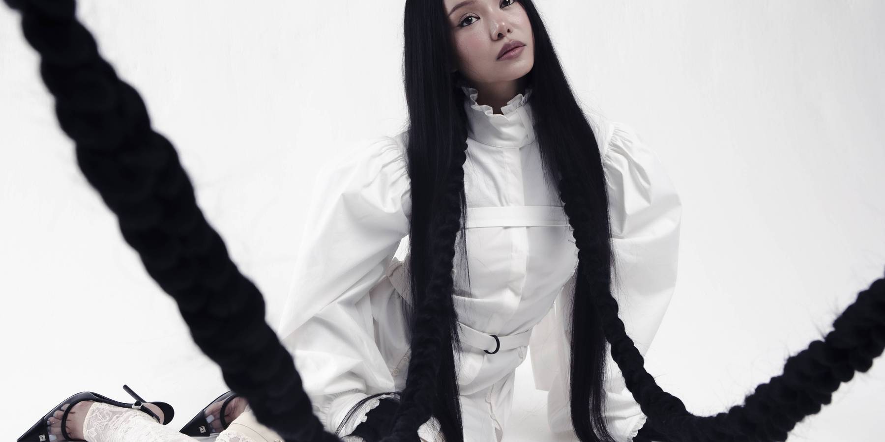
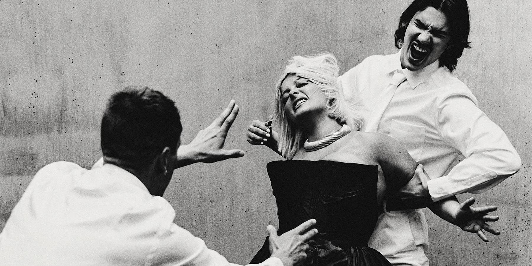
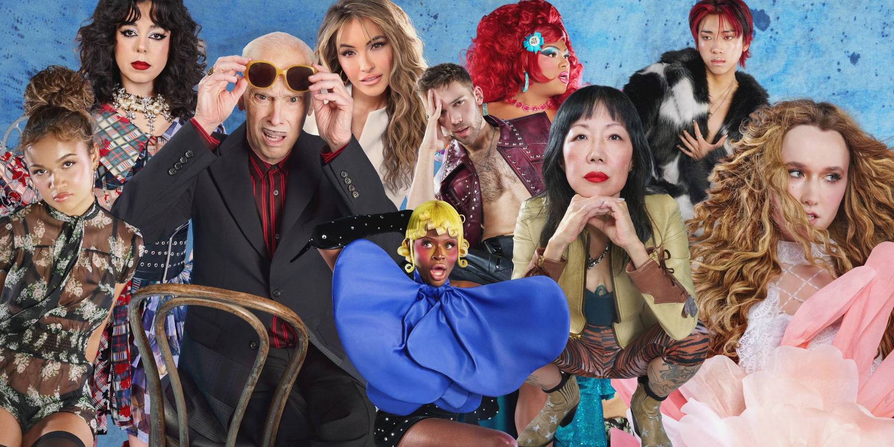
Anna Sui’s career stands as one of New York fashion’s most compelling success stories—an ascent from the city’s downtown underground to a global brand with an instantly recognizable point of view. Early on, she immersed herself in the creative scene that defined the era, moving alongside image-makers like Steven Meisel and absorbing the raw energy of the city’s cultural undercurrent. A pivotal early moment came when Madonna wore one of her designs to a Jean Paul Gaultier show, a stamp of visibility that helped propel Sui from insider favorite to a designer with real industry traction.
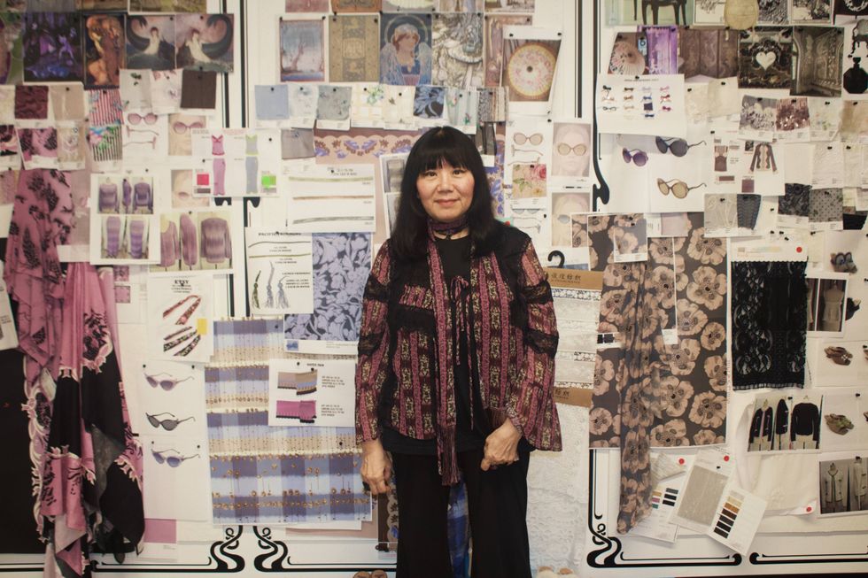
More than two decades after launching her label, Sui continues to evolve within the fashion landscape while remaining deeply rooted in her original vision. Ahead of the presentation of her SS26 Wonderment collection, she welcomed PAPER into her studio for an exclusive preview, offering insight into the inspiration behind the collection, reflections on how the industry has shifted in recent years, and intimate details of her creative process.
For this collection, everything began with a photograph from Vogue in the 1970s, a reference point that set the tone for what would follow. Vintage fabrics are mixed with newer materials, neon tones are layered with dreamy slip dresses, and that unmistakable free-spirited energy—long associated with the Anna Sui girl since the golden ’90s era of Kate Moss, Naomi Campbell, and the original supermodel generation—feels more alive than ever.
For the Wonderment collection, the team even revisited one of Kate Moss’s iconic ’90s looks: a black dress covered in star-shaped stone embellishments. Chic, rock ’n’ roll, and unmistakably Sui, it reinforces a core idea at the heart of the collection—that fashion is cyclical, where trends return, but true style endures.
A couple of days before the show, PAPER got to chat with designer Anna Sui...
How did this collection start?
I love finding something you’ve never seen before or even heard about—something that takes you down this rabbit hole of discovery, research and inspiration. That happened when I came across these images.
I was actually looking through an old ’70s Vogue for a hairstyle that Gallant (Ara Gallant) and I had been talking about on the phone. I saw this image of Justine Cushing in Newport, and I remember thinking, What the hell is on her walls? You couldn’t really see the paintings clearly.
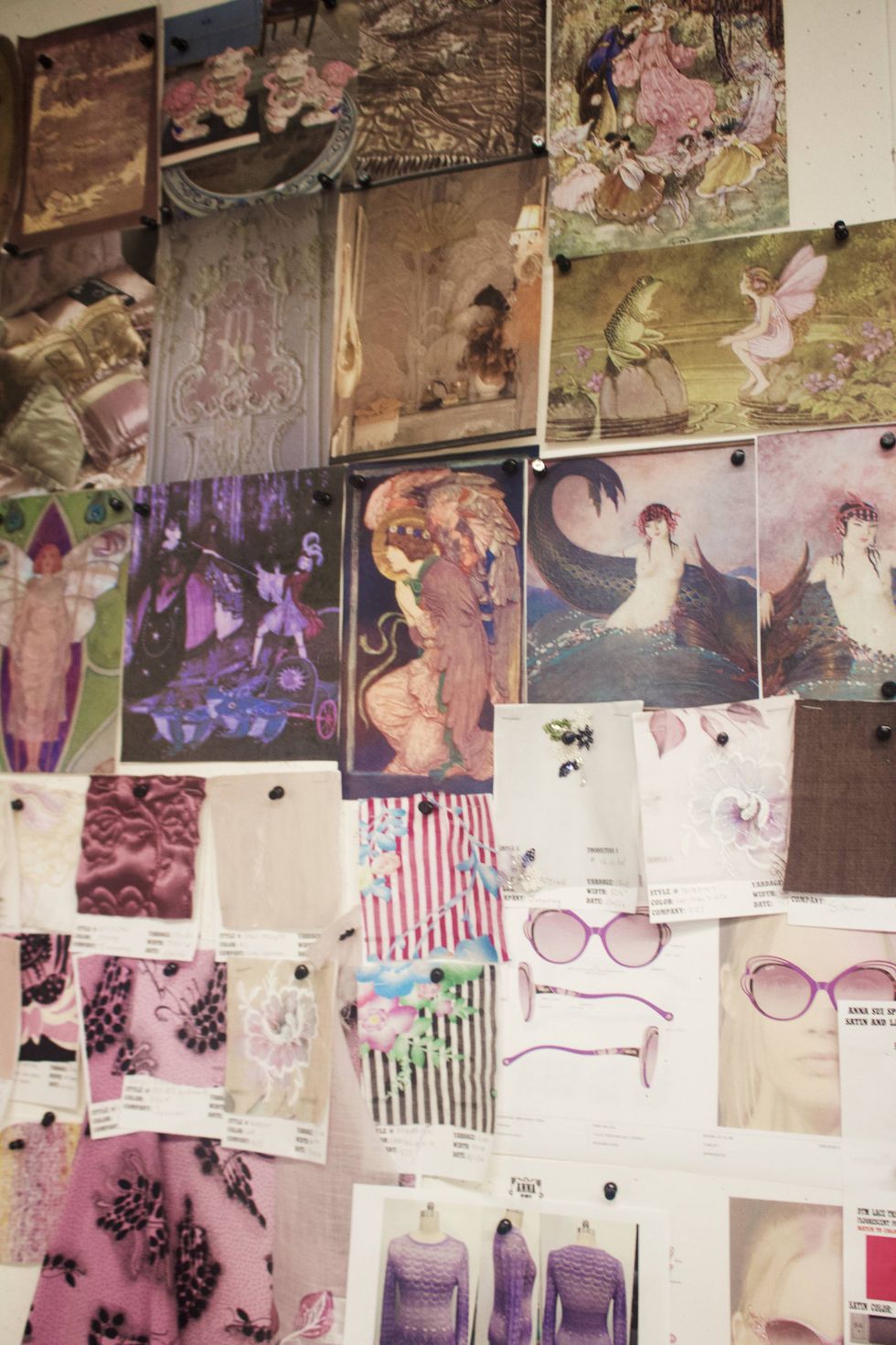
I kept flipping through the issue and eventually found more photographs of her house. It seemed fairly conservative, but then she had all these incredible fairytale paintings covering the walls. I started researching them and discovered they were painted by her uncle, Howard Gardiner Cushing.
He was painting around the same time as Whistler and Sargent, and he loved this kind of fairytale imagery. There was actually a major exhibition of his work in Newport last year. Some of the paintings had originally been painted directly onto the walls, so they had to be carefully removed and framed.
He was also very good friends with Gertrude Vanderbilt Whitney. There are photographs of him painting in her studio. It’s fascinating because I’ve looked through that magazine many, many times before, but for whatever reason, it never clicked until now. Suddenly, because I was thinking about fairytales and this particular world, I saw it completely differently.
Is that feeling of discovery something you want people to experience with the collection?
Absolutely. I want people to appreciate that moment when you get that rush of inspiration because you’ve encountered something you’ve never seen before. Go with it. Explore it. Let it inspire you instead of just scrolling past it.
I love when something stops you and really takes you somewhere else. There’s something magical about that.
In the past, maybe you would see something at a library or in a magazine, and because you didn’t have thousands of images constantly in front of you, that one image could really stay with you. Now we see so much every day that we can start taking it for granted.
I hope younger generations can find that feeling again because it’s so important to have inspiration and dreams—to have that moment when something changes you and brings you somewhere else.
Do you think there’s a desire to return to something more analog?
I think so. People are getting tired of everything being digital. There’s something about going back to making things manually, being creative in a different way and actually letting the inspiration go through you instead of just consuming it.
How did those fairytale references translate into the collection itself?
The collection is very tied to that inspiration. The fairytales really informed the entire color story.
While researching, I discovered artists who were actually using mother-of-pearl in their work. I loved the luminescence of it, so we started bringing that quality into the collection. I worked with Showroom Seven on jewelry using abalone and mother-of-pearl, including some of the headpieces. They have this really magical quality.
That iridescence became something we explored throughout the clothes, jewelry and accessories.
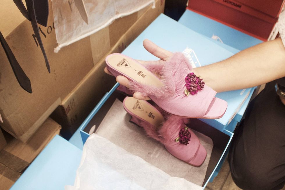
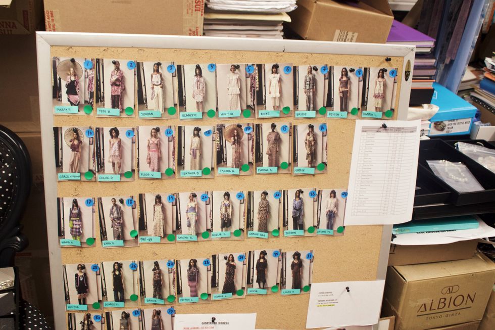
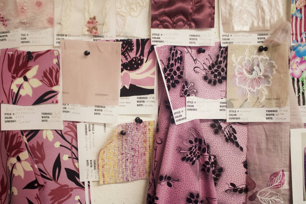
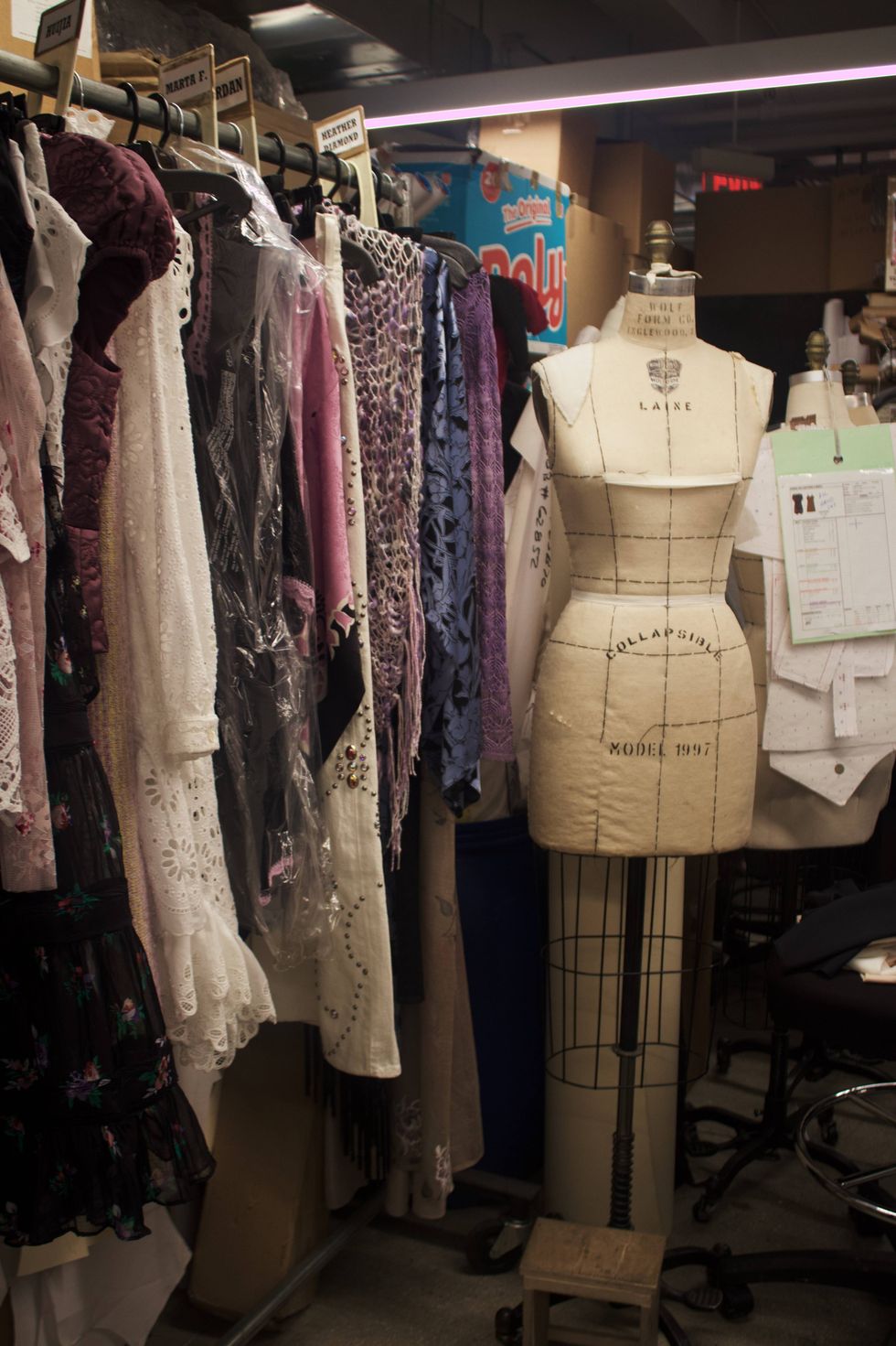
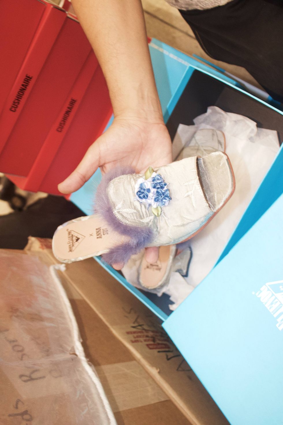
The shoes also have that romantic, almost boudoir feeling.
Yes. We did shoes inspired by boudoir slippers, and I worked with John Fluevog again. We found vintage fabrics and somebody who still makes these beautiful old-fashioned rosettes.
There are embroidered fabrics, Thai silks and different colors that correspond to the collection—the orchid, denim blue, browns and black. Some of those fabrics were probably originally developed for upholstery or pillows, but they work perfectly for shoes.
Was there a particular look that made you especially excited?
I think you’ll see it in the opening look. There’s a fairytale print, and throughout the collection there are these Art Nouveau references and a lot of hand craftsmanship.
I’ve always loved eyelet because it feels so Victorian and romantic to me. There are also pajama elements, camisoles and skirts with hand appliqué, and then we layer everything together.
There are these special paillettes that look almost like mother-of-pearl. We have a fabric we call Moonlight Roses because of its iridescence—it’s partly embroidered, partly printed and partly sequined. I love combining all those different techniques.
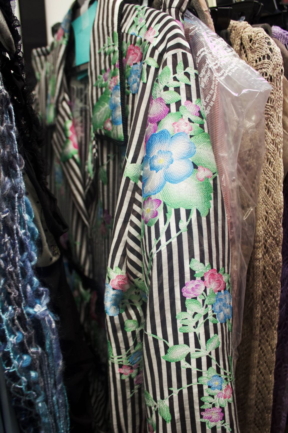
There’s also a jacquard that’s printed and embroidered digitally. In the past, something like that might have required embroidery on top of the fabric, but now it can all be developed together.
There’s romance, but there’s also this grunge energy running through everything.
Yes, there’s definitely some of that energy. But it’s magical.
You might have a beautiful satin-striped fabric styled in a very grunge way, or an iridescent top worn over chartreuse crushed-velvet pants. There’s a satin dress with a plaid shirt tied around it and a lace T-shirt underneath.
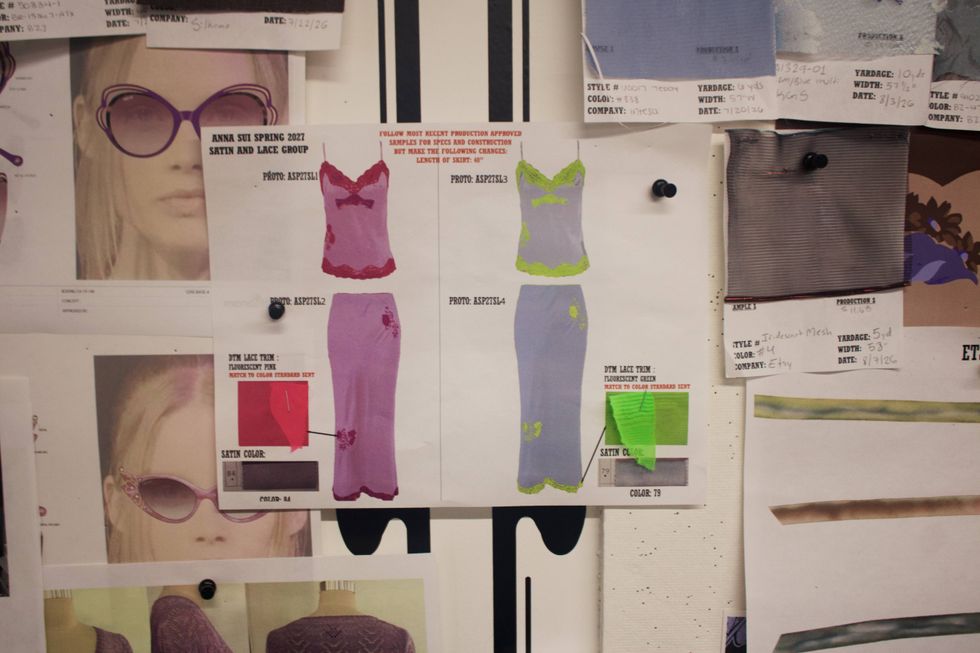
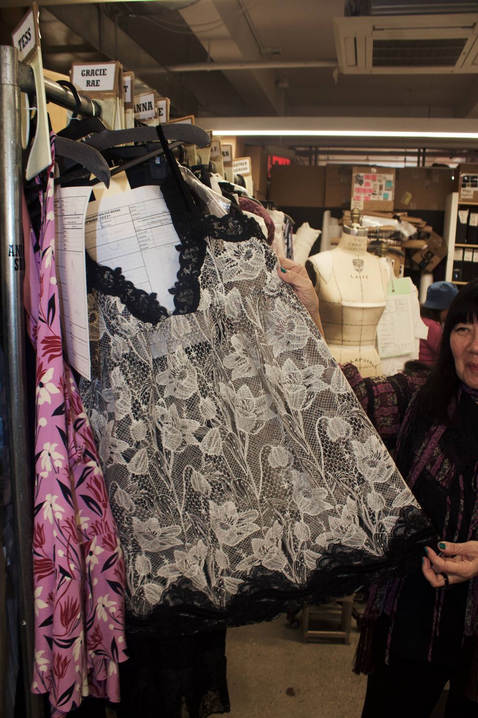
We also have lattice embroidery layered over fluorescent lingerie, so the neon peeks through. There’s a lot of texture and sheerness, with everything layered on top of everything else.
It’s witchy, it’s ’70s, it’s grunge—it’s all those things that I love. But because everything is sheer, iridescent and very floaty, I think it feels magical.
It also feels effortless. The girl is dressed up, but she doesn’t look overly concerned with looking perfect.
Exactly. That’s what I love about it. She looks pretty and fresh, but not worried about it.
Once you have the initial inspiration, what happens next?
We start sourcing fabrics. I talk to my staff, we establish the color story and then we start developing prints.
We look at vintage prints and different print collections and begin putting everything together around those colors. This season, it was the orchid, denim blue, black and white. You can see how directly the palette reflects the original research.
I also found this incredible lacquer piece with mother-of-pearl inlay at the Musée des Arts Décoratifs in Paris. That inspired some of the embroideries and the jewelry. We’re constantly going back to the original research while we’re developing the collection.
You’ve designed so many collections. What makes this one feel particularly connected to the present moment?
I think this is how people want to dress right now. It’s how people are dressing and how they’re buying vintage to create these kinds of looks. It’s what I’m wanting too.
You could probably create this entire look using vintage clothes, but here we get to develop our own color combinations so everything works together and feels connected.
Researching all these fabrics with different kinds of iridescence was also so much fun. We were trying to create this magical combination of things. There are hand-dyed ribbons throughout the collection and all these tiny details.
I also found someone who makes these incredible scrunchies, so he created custom ones for us with tulips and calla lilies. It’s all those little details combined together that I love.
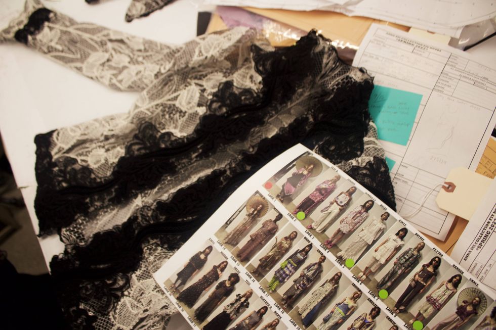
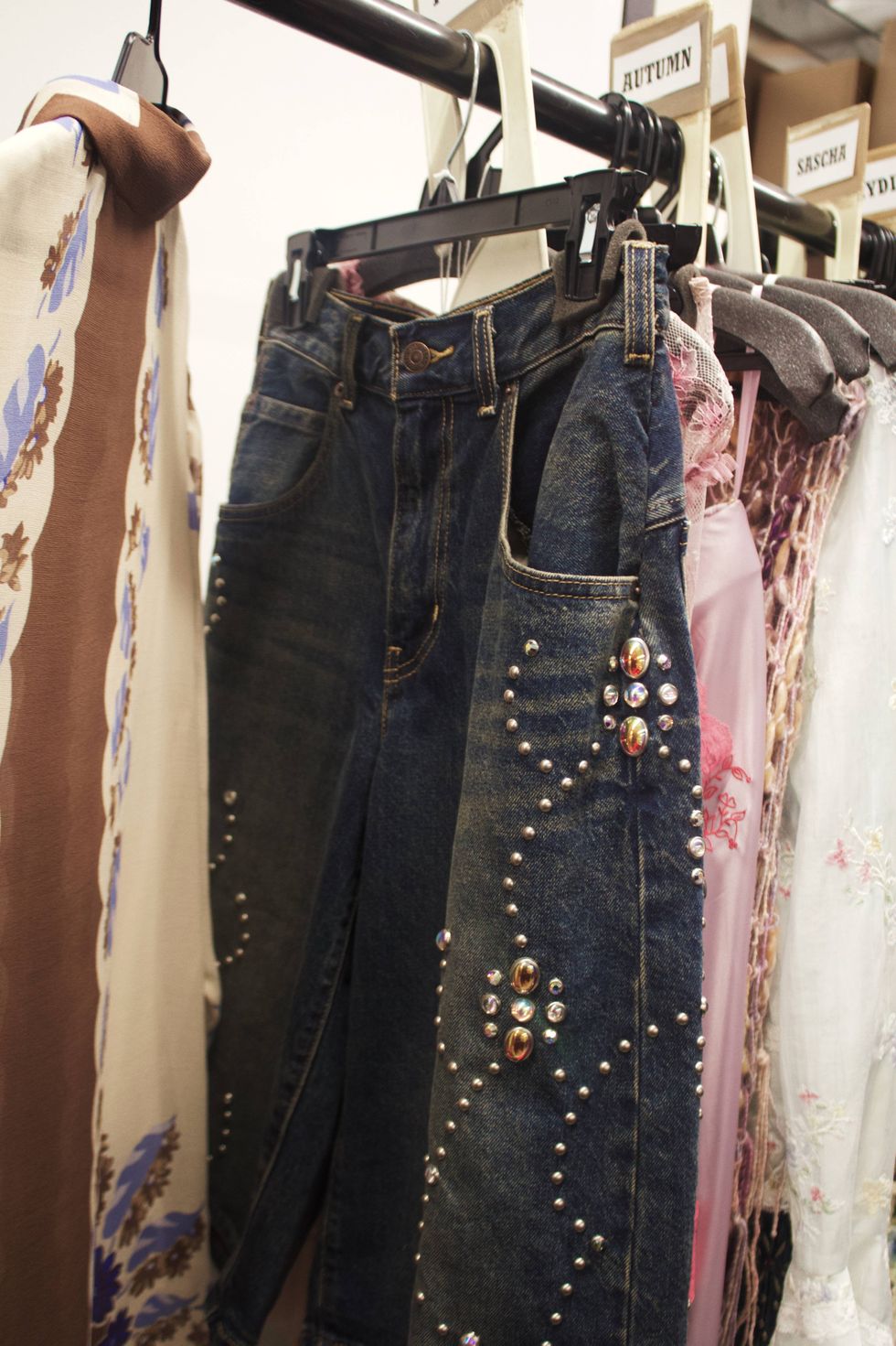
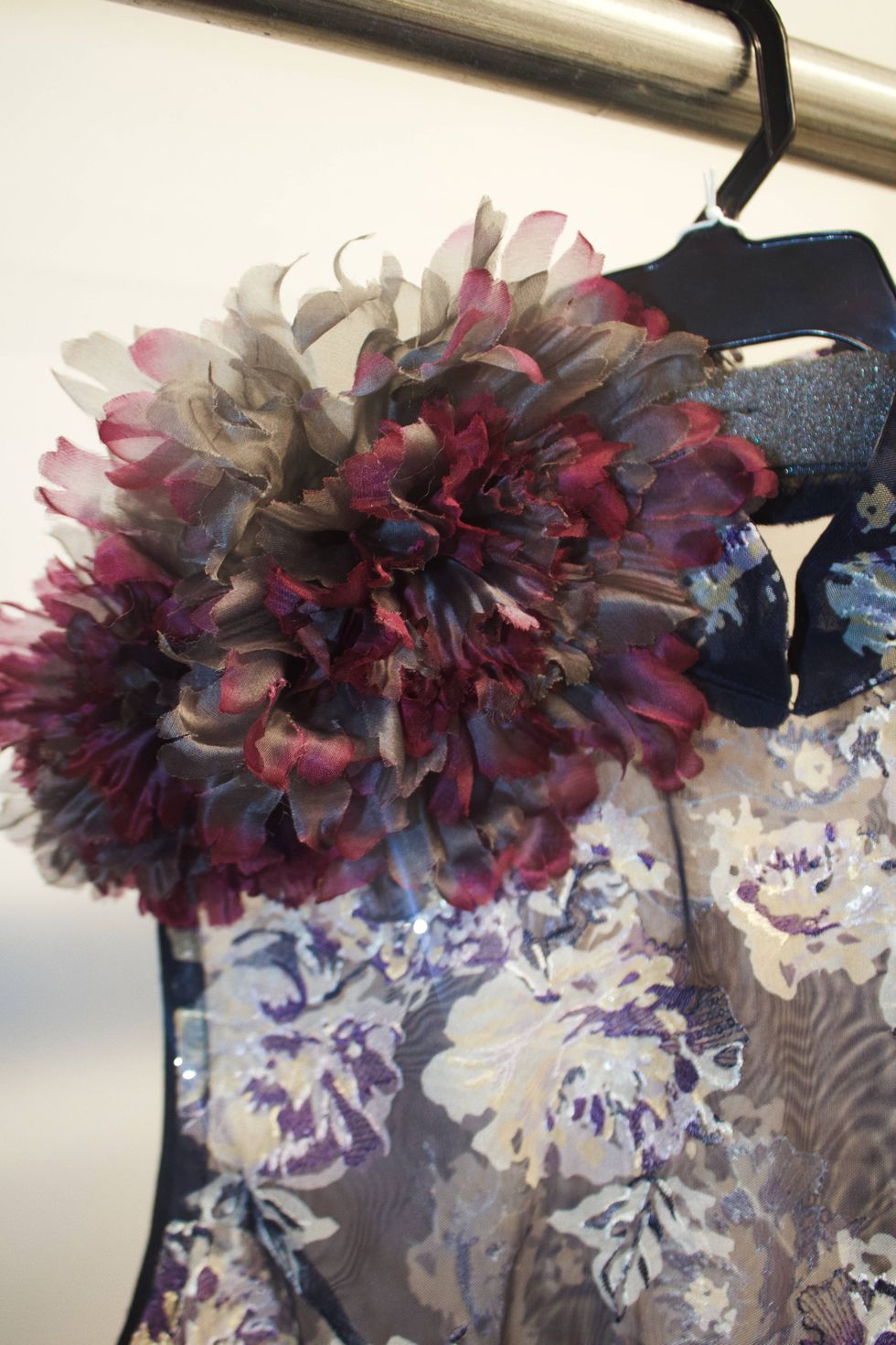
The accessories feel like an extension of that world rather than something added afterward.
They really are. Karen Erickson at Showroom Seven did the jewelry, and I’ve worked with her since my first show, so she’s a longtime collaborator.
The eyewear has these Art Nouveau shapes with rhinestones and pearls. Then you have the embroidered shoes in denim blue and orchid, the floral scrunchies, the mother-of-pearl jewelry—it all belongs to the same world.
Walking through the clothes, there’s an incredible amount of texture.
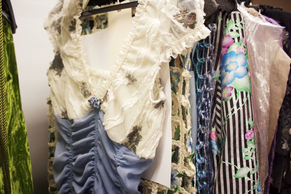
There really is. We have jeans with iridescent cabochon stones, glitter stretch, crochet knits and the Moonlight Roses fabric mixed with sequin embroidery.
There’s a mauve denim corset top, sheer iridescent fabrics, hand-dyed ribbons and rose-quartz paillettes. There are pajamas, shawls and bags that are hand-knit and hand-crocheted.
Then you have lingerie layered underneath lattice skirts so you see the fluorescent colors peeking through. There’s so much layering in the styling. I thought, Why not layer all these beautiful pieces together?
The fabrics almost tell the story themselves…
Exactly. The colors, the way they move with the light, the iridescence—they start to resemble those fairytale paintings.
We have an embroidery that we actually call Fairytale Embroidery because of that quality. There are sheer tunics worn over jeans, Art Nouveau-print robes, hand-embroidered halters, crinkle chiffon with rock-crystal trim and more versions of Moonlight Roses.
There’s this lace I especially love this season that we used for a little mini dress and jacket. Then there’s point d’esprit with embroidery, which is very sheer, and more of those mother-of-pearl-like paillettes.
There’s also a piece from your archive reappearing this season…
Yes. We’re working with Swarovski on a dress that Kate Moss originally wore for us in the ’90s. We recreated it with Swarovski, which has been really fun. They also worked on some of the jeans.
I love that something from the past can come back into the collection and still feel completely connected to everything we’re doing now.
If you had to choose, what pieces would you personally wear the most?
Probably all the black pieces.
There’s a Swarovski piece that we wear with a pinafore and capri pants, a corset top with pajama pants, an eyelet tunic over a petticoat skirt, and another mother-of-pearl-inspired embroidery that references the black lacquer furniture from my research.
There’s also a crocheted cardigan and skirt, the fairytale-print skirt with a kimono-sleeve jacket, and different combinations of the crochet knits.
Is there anything else you’re especially excited about right now?
My museum exhibition, The World of Anna Sui, is coming to my hometown in Michigan on October 17 at Cranbrook.
The exhibition was here in New York a few years ago and has been traveling around the world. It started in London and has gone to Tokyo, Shanghai, Florida, North Carolina and Phoenix. Now it’s finally coming to Michigan, my hometown, which I’m really excited about.
Photography Saint Vazquez