
Everyone's Memeing the New CIA Logo
By Sandra Song
Jan 05, 2021Today in our dystopian hellscape, the CIA has introduced an aesthetic rebrand that feels better suited to a rave flyer or millennial pop-up shop than a war-mongering government agency.
On Monday, the CIA launched a full-scale rebranding effort meant to encourage a younger, "more diverse" talent pool and distance itself from its "old boys club" reputation. And so in tandem with the hashtag #DiscoverCIA, the organization debuted a new website and logo design — much to the chagrin of Twitter.
As people online noted, with its black-and-white circle and wavy lines, the CIA logo wouldn't feel out of place on a flyer for a techno festival or a "Boiler Room set," as DJ/producer Dani Deahl said.
"CIA rebranding as a modular synthesizer festival in Berlin," comedian Sarah Squirm added, while journalist Max Pearl went on to point out that the logo is "literally a Mutek poster."
Can't wait for the CIA Boiler Room set https://t.co/QlHBXbHxDa
— Dani Deahl (@danideahl) January 4, 2021
CIA rebranding as a modular synthesizer festival in Berlin pic.twitter.com/3PQwejMGUq
— SARAH SQUIRM (@SarahSquirm) January 4, 2021
The new CIA logo is literally a Mutek poster pic.twitter.com/3RsPzWzDFt
— snacks pearl (@maxpearl) January 4, 2021
cia bout to drop the phattest lineup for the biggest Detroit techno party since 1997 pic.twitter.com/ibQYaizWex
— dj dadrock (@domigan) January 4, 2021
Meanwhile, others couldn't get over the logo looking like the album art for some band who's "gonna be on Pitchfork's Best New Music soon," with people like writer Bradford Pearson joking that, "CIA about to drop a new 7" on Sacred Bones."
CIA about to drop a new 7" on Sacred Bones https://t.co/cnwhGMGFzP
— Bradford Pearson (@BradfordPearson) January 4, 2021
cia gonna be on pitchfork's best new music soon
— gage (@limonpepperwet) January 4, 2021
CIA new EP out 02.01.21 pic.twitter.com/p3YtvFkWsX
— Liz Franczak (@liz_franczak) January 4, 2021
this cia rebrand crazy pic.twitter.com/2BMfWWt4Qd
— femboj zizek (@girlrifle) January 4, 2021
And many more thought it looked like a design for a brand like Urban Outfitters, a website like The Intercept or, as creative director Zach Roif wrote, a "'hungry independent ad agency focused on their culture as much as their work.'"
finally a website for people who want to overthrow democratically elected leaders and also buy a $700 vibey ceramic planter
— Sam Biddle (@samfbiddle) January 4, 2021
Rejected redesign for the CIA pic.twitter.com/PGULcfzb9B
— ᖇYᗩᑎ (@bjorlax_) January 4, 2021
the cia redesigned its website to look like *the intercept* pic.twitter.com/JGVMseTjGn
— Ali Breland (@alibreland) January 4, 2021
The CIA just rebranded to look like “hungry independent ad agency focused on their culture as much as their work” pic.twitter.com/XCnn6FGuDg
— rack zoif (@zckrf) January 4, 2021
And while the CIA has yet to address the memes (amongst many other things...), thanks to our fellow Twitter users, at the very least we now can see a mock-up of what their merch would look like. Talk about bleak.
Took 20 minutes out of my day for this pic.twitter.com/9Xsfai3cJe
— CommercialArtist (@Commercial_4rt) January 4, 2021
Photo via CIA
MORE ON PAPER

Entertainment
Meg Stalter and Paul W. Downs Would Kill For Each Other
Photography by Vijat Mohindra / Story by Joan Summers
Photography by Vijat Mohindra / Story by Joan Summers
08 June
Entertainment
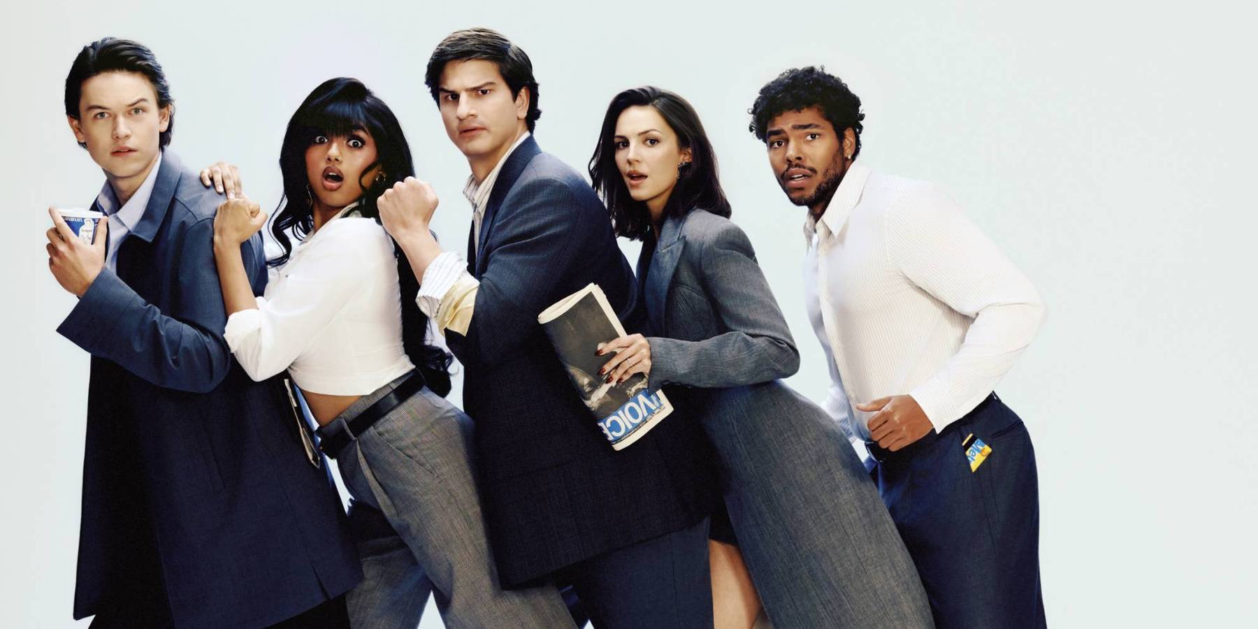
Mindy Kaling’s Not Suitable For Work Cast Are Just Getting Started
Photography: Caroline Tompkins / Story: Stephen Daw
Photography: Caroline Tompkins / Story: Stephen Daw
02 June

Music
i-dle Is Always Evolving
Story by Crystal Bell / Photography by Baz
Story by Crystal Bell / Photography by Baz
26 May
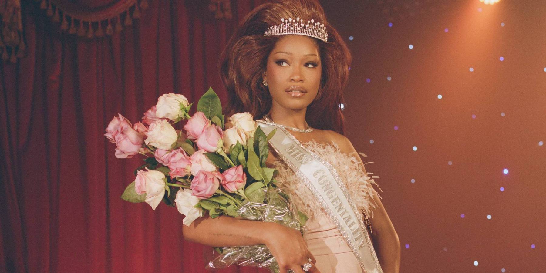
Entertainment
Keke Palmer Earned Her Crown
Photography by Williejane / Story by Joan Summers
Photography by Williejane / Story by Joan Summers
21 May

Entertainment
Erin Moriarty and Karen Fukuhara, 'The Boys' Girl's Girls
Story by Joan Summers / Photography by Anna Koblish
Story by Joan Summers / Photography by Anna Koblish
15 May