• Home
  • LGBTQ
  • Sex & Dating
  • Fashion
  • Beauty
  • Nightlife
  • Celebrity
  • Internet
  • Entertainment
  • Break the Internet ®
  • Music
  • Film/TV
  • Art
  • Care
  • Pride
  • Politics
  • It's Nice to Laugh
  • Born This Way
    papermag
    Music
    Fashion
    Celebrity
    papermag
    Nightlife
    Internet
    Art
    Español
    • Music
    • Fashion
    • Celebrity
    • Nightlife
    • Internet
    • Art
    • Shop
    • Privacy policy
    • Terms
    • Contact Us
    • RSS
    Zara's New Logo Is a Little Too Close for Comfort
    Internet

    Zara's New Logo Is a Little Too Close for Comfort

    Matt Moen
    31 January 2019

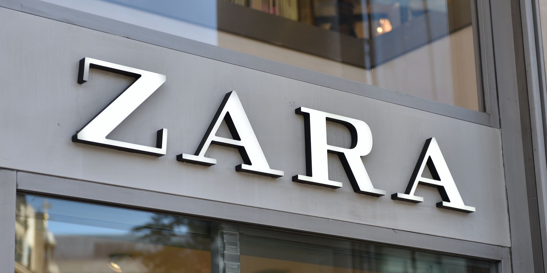
    In this week's installment of graphic design news, Zara's new logo has everyone feeling a little claustrophobic.

    Only the second time the Spanish fast-fashion company has changed their logo in their entire 45-year history, Zara unexpectedly revealed their new logo today eschewing their previously more spacious look for a tighter knit design. The new Zara is the work of French design agency Baron & Baron, best known for their previous work for Harper's Bazaar, the new logo utilizes their signature typography to offer more accentuated curves to the previously ridged lettering cutting out the excess space for an overlapping layout.

    Related | Melania Trump's Tacky Zara Jacket Selling for Insane Prices Online

    A significant departure from the company's previous look, Zara's new logo left many feeling like they just needed to get some space today with others taking to Twitter to voice their critiques of the cluttered design:

    — (@)
    — (@)

    Perhaps an allegory for the cluttered closet that fast fashion generates, maybe Zara's new logo is merely just reflective of the times. Space is at such a premium that cutting company costs even means cutting out any remaining room between the letters hanging above the store entrance. And while it may have had graphic designers hyperventilating into paper bags all across the timeline, others chose to see the humor in the new design:

    — (@)
    — (@)

    Photo via Getty

    From Your Site Articles
    • CIA's New Logo Sparks Memes - PAPER ›

    MORE ON PAPER

    The Hottest Celebs at the Golden Globes Weren't the Nominees

    The Eternal Curse of 'Bye Sister'

    'The Real Housewives of Salt Lake City' Needs a Time Out

    La clave del éxito: Familia, raíces y música según Clave Especial

    Save Me From the 'Drag Race' Sketch About 'Heated Rivalry'

    Staying Up All Night For NYE With Jennifer Lopez in Las Vegas

    Let Cquestt Take You on a Side Quest

    The 'Vanderpump Rules' Cast Need to Take Their Shirts Off

    25 of the Most 2025 Moments on the Internet

    Los 20 fotógrafos que definieron el 2025

    Por qué Lil Eddie, productor ganador del Grammy, apuesta por el futuro de la música latina

    'The Real Housewives of Beverly Hills' Are Dressed for Their Funeral

    © PAPER. All Rights Reserved
    AboutContactRSSPrivacyTerms
    Entertainment

    2025 Was the Year of the Villain (Again)

    Eleanor Jacobs
    © PAPER. All Rights Reserved
    AboutContactRSSPrivacyTerms